 Over Mij
Cases
Over Mij
Cases
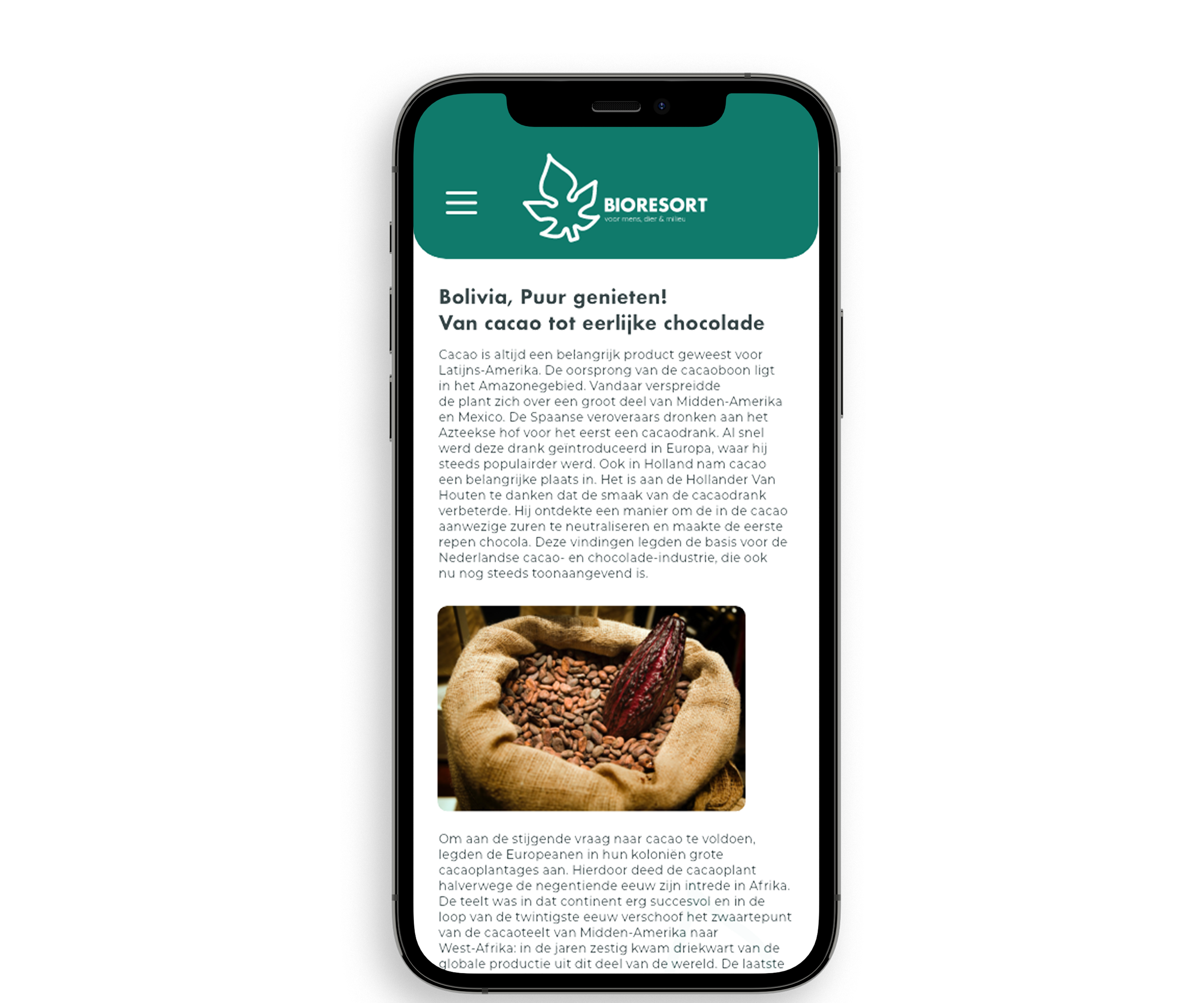
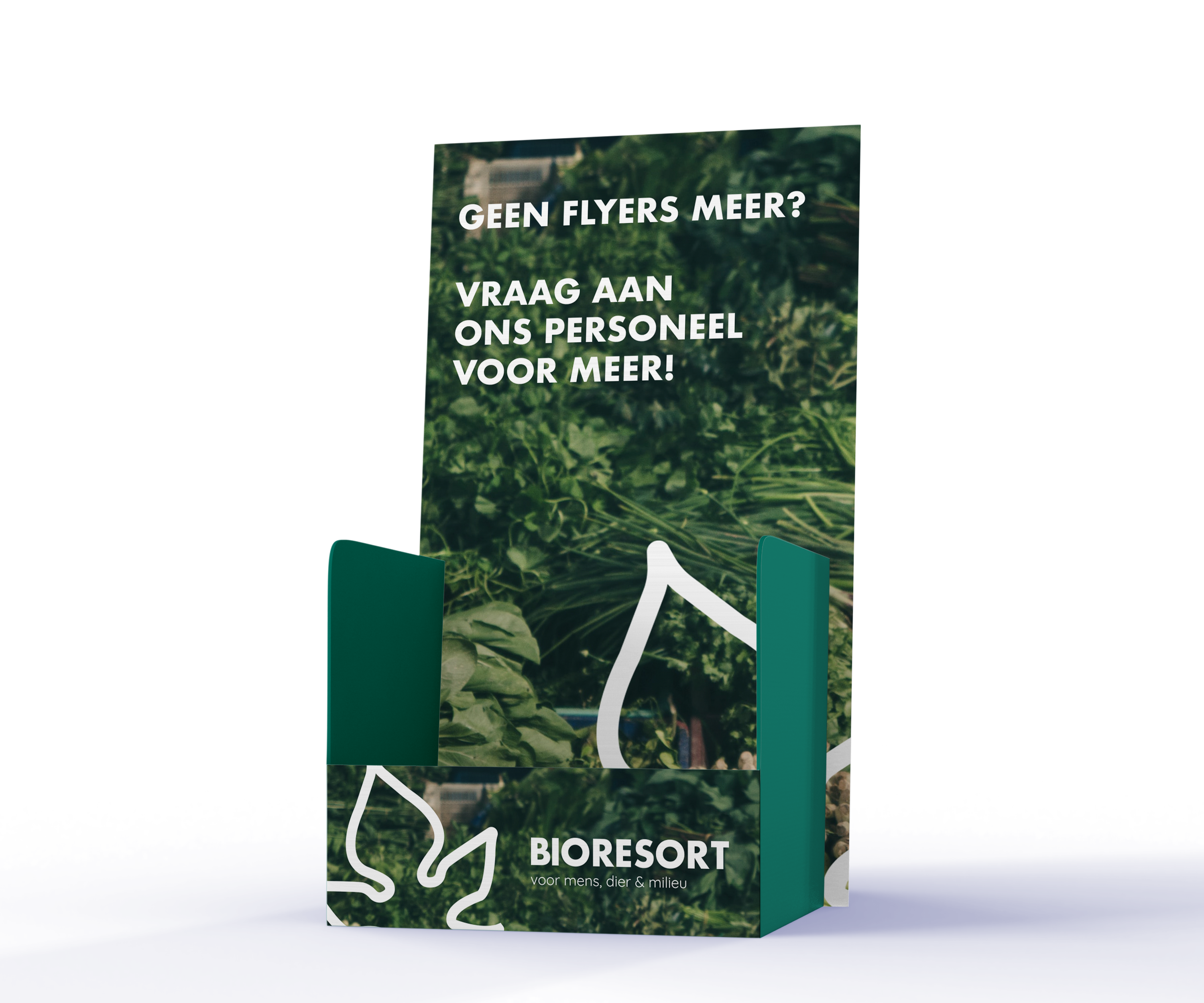
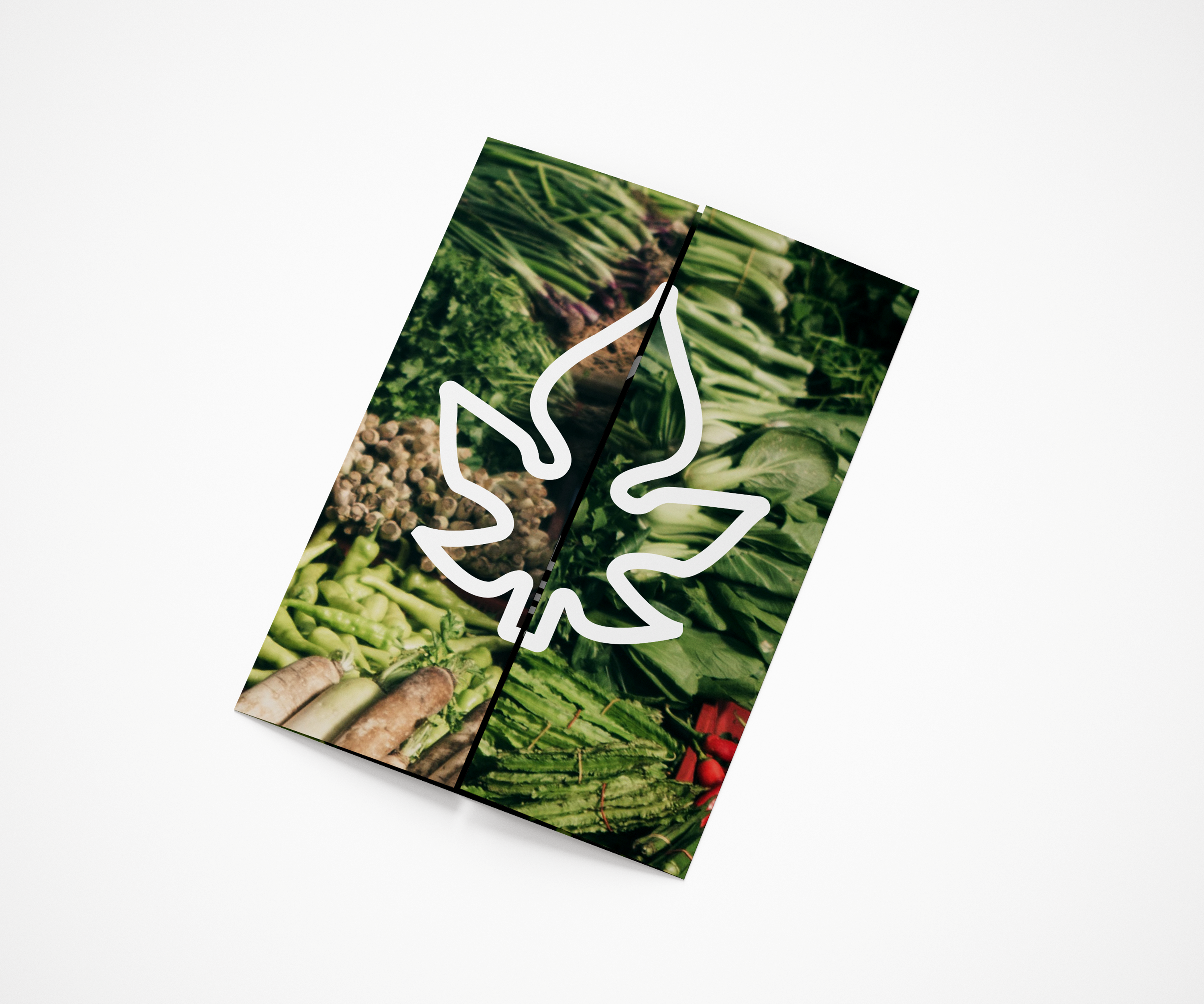
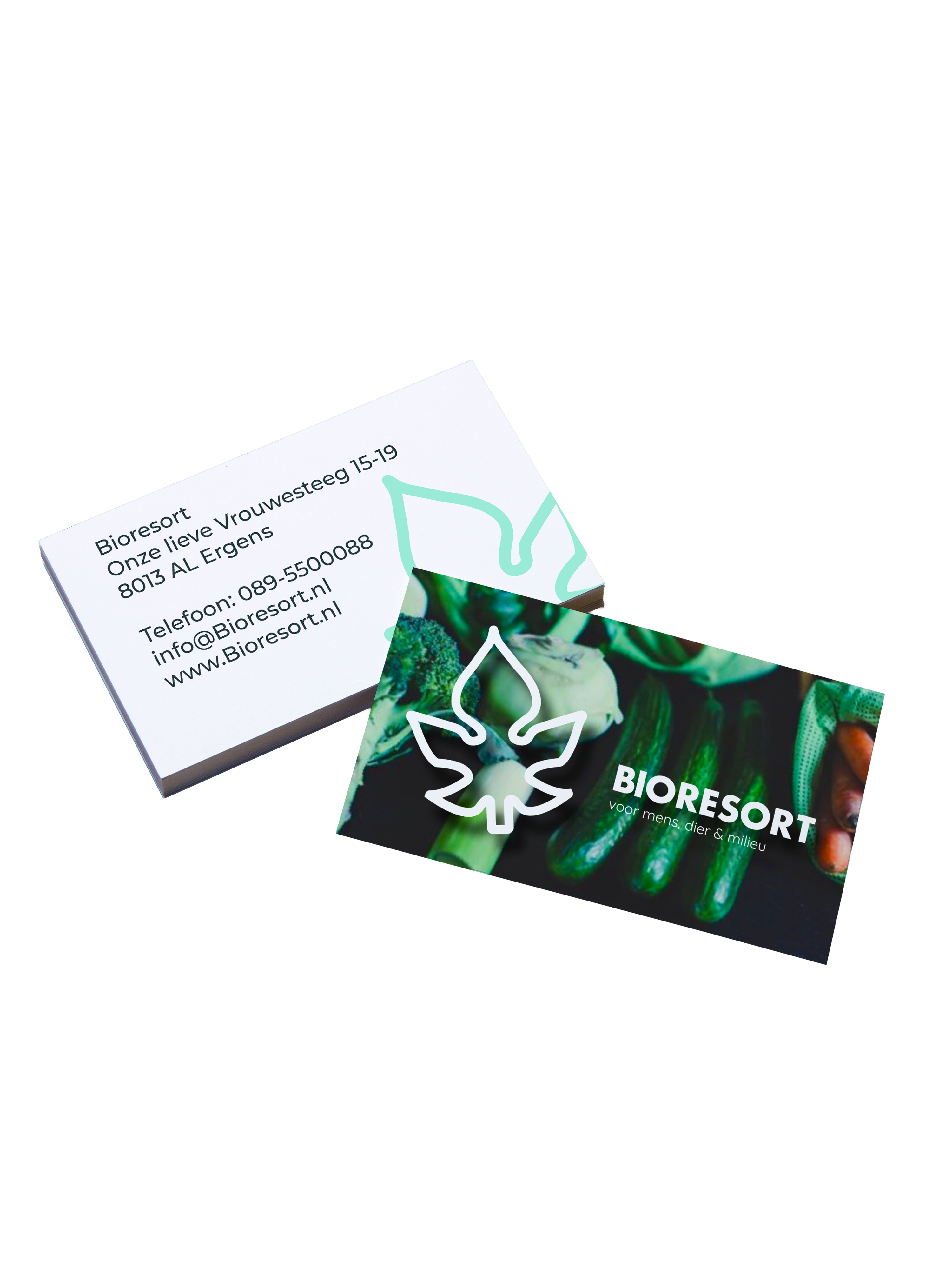
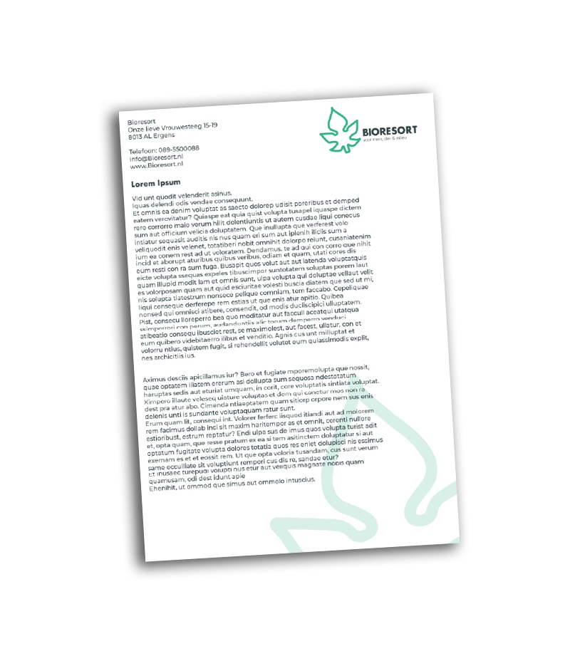
Voor Bioresort heb ik een concept ontwikkeld dat de biologische supermarkt positioneert als een moderne en relevante speler. Door afstand te nemen van traditionele imago-kenmerken, sluit de winkel nu naadloos aan bij de belevingswereld van volwassenen tussen de 30 en 40 jaar die waarde hechten aan gezonde voeding en een bewuste levensstijl.
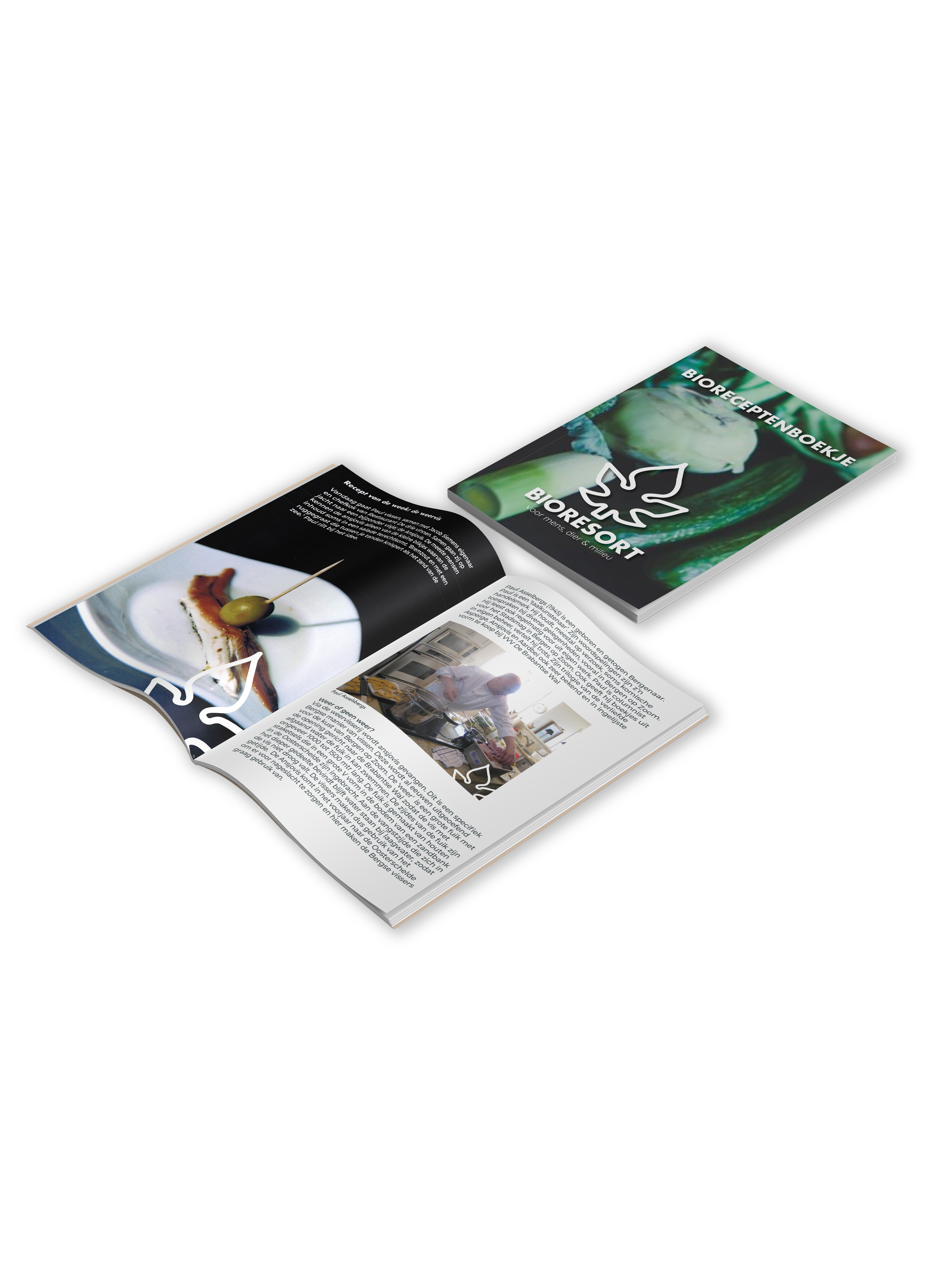
De look en feel is strak, modern en creatief, waardoor Bioresort zich duidelijk onderscheidt binnen de retailsector. Met een scherp oog voor mens, dier en milieu zijn duurzame waarden vertaald naar een heldere visuele identiteit. Het resultaat is een professionele winkelervaring waar verantwoorde keuzes en een eigentijds design hand in hand gaan. Hieronder zijn de producten zoals een receptenboek, baliedisplay & een app die ik heb gerealiseerd voor Bioresort.