 Over Mij
Cases
Over Mij
Cases
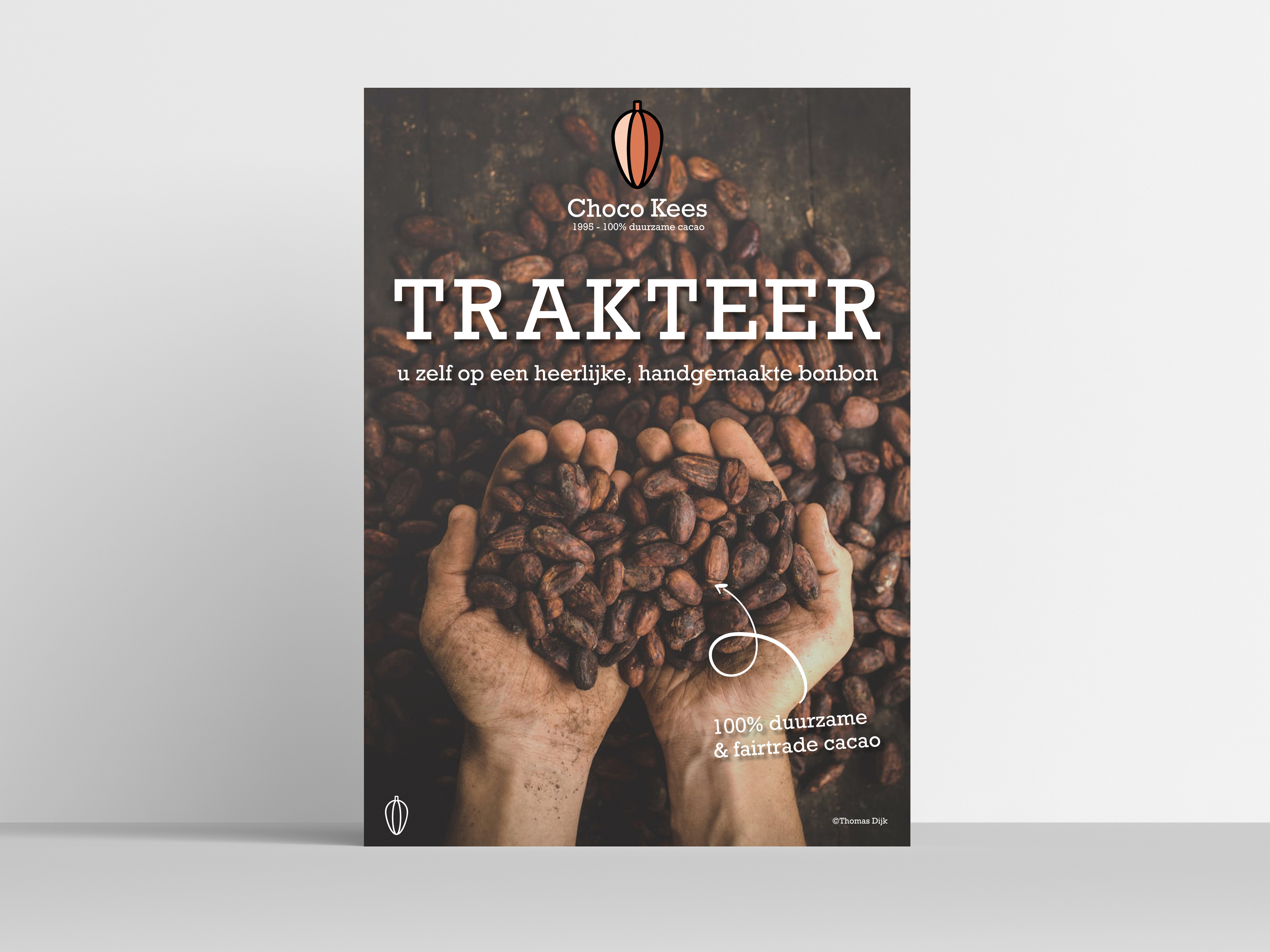
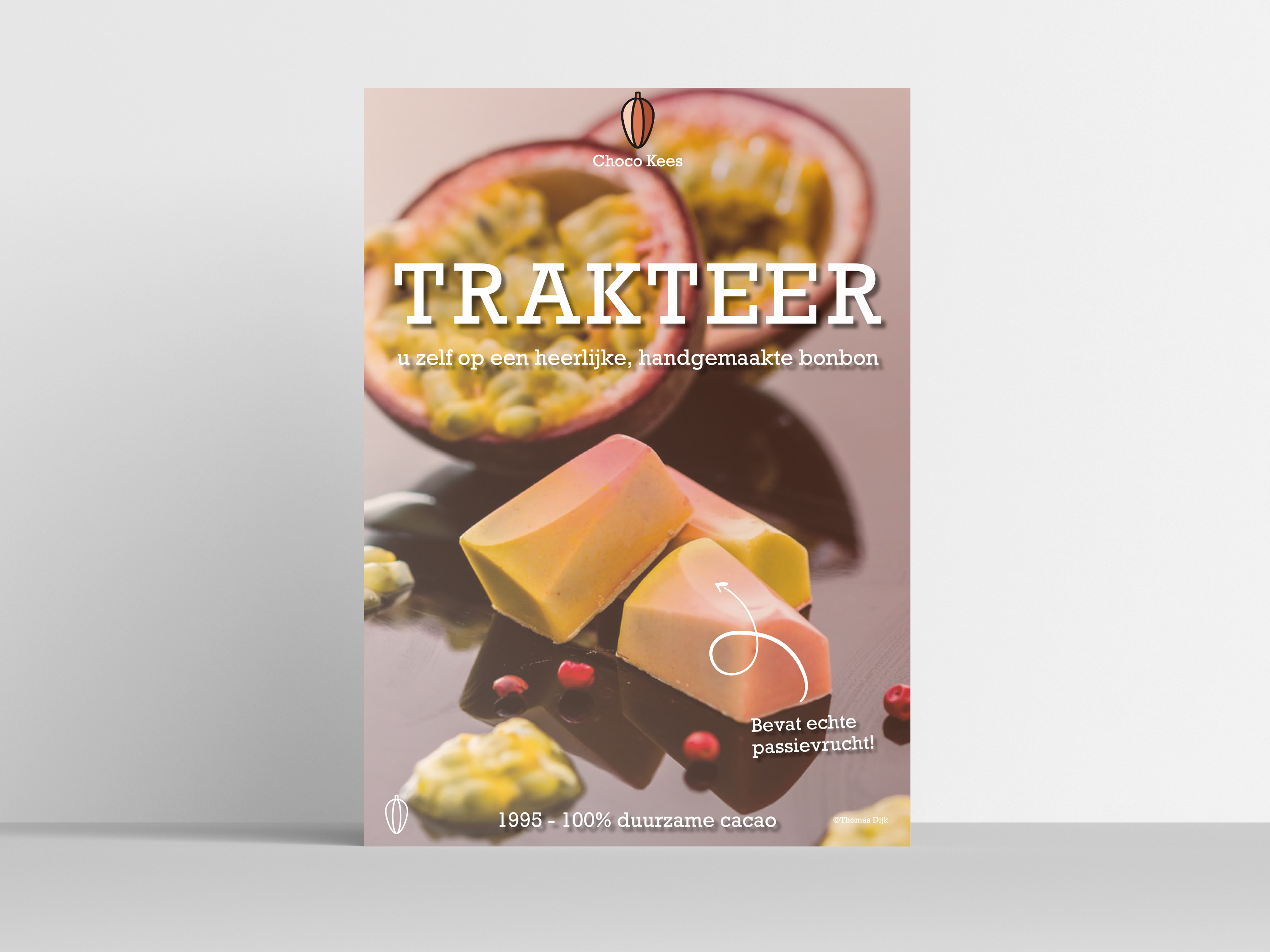
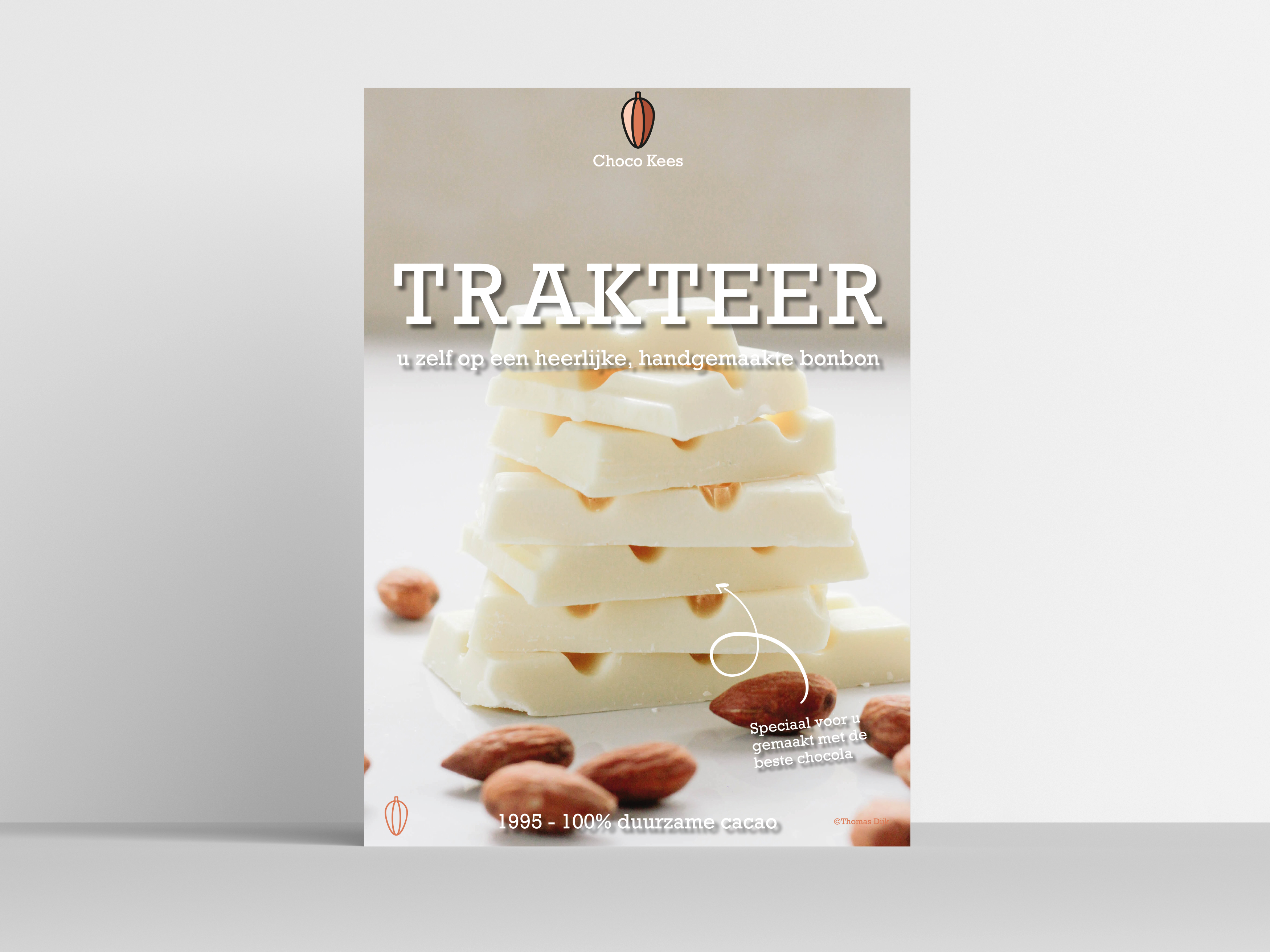
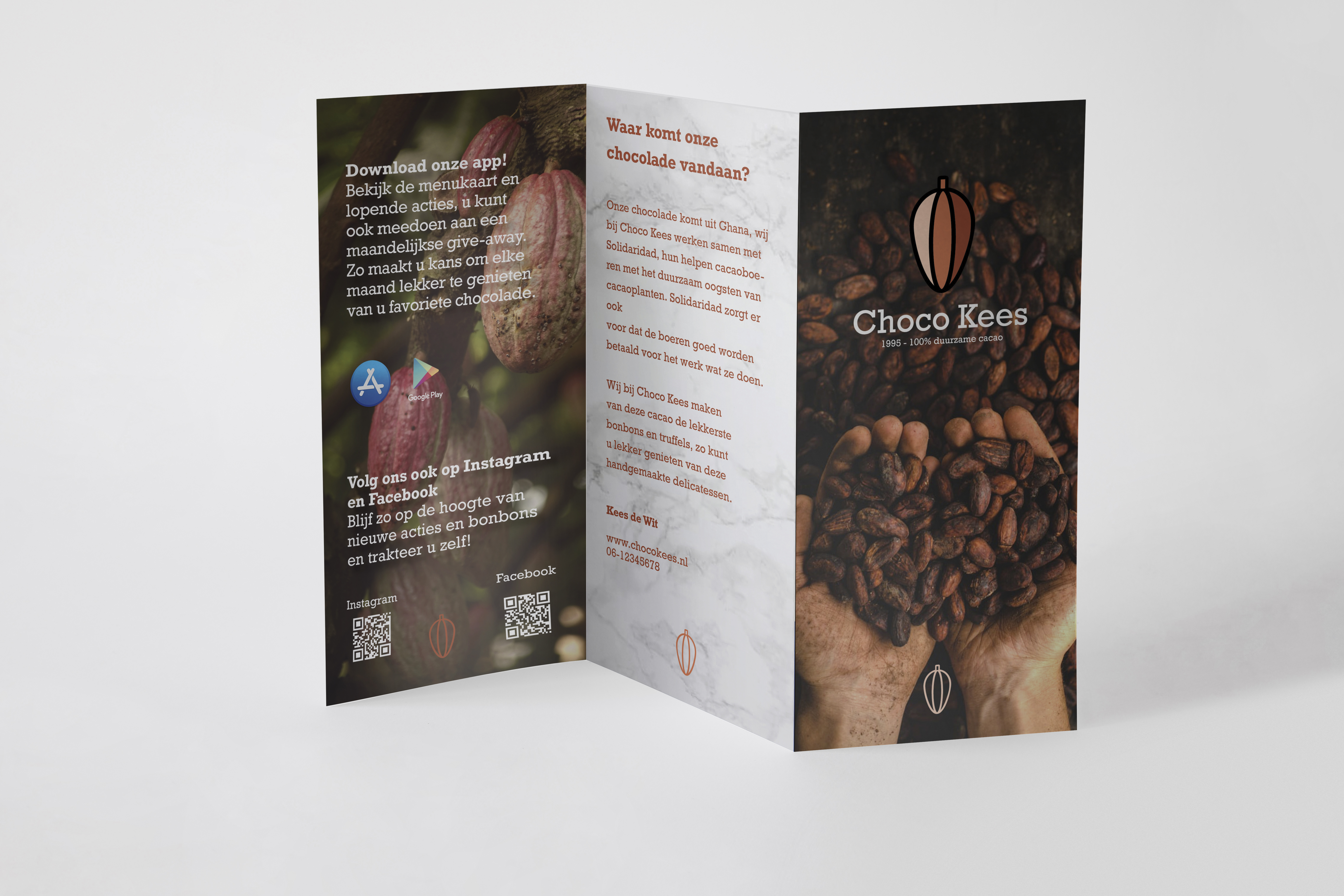
Na 25 jaar ambachtelijk vakmanschap dreigde de authentieke bonbonnerie Choco Kees de aansluiting met de markt te verliezen door een verouderde uitstraling. Waar de kwaliteit van de handgemaakte bonbons onbetwist was, zorgde het oubollige interieur en een gedateerd logo voor een negatieve associatie bij de beoogde doelgroep. Er ontstond een opvallende discrepantie: de kritische consument vond de presentatie in de lokale supermarkt zelfs luxueuzer ogen dan die van deze speciaalzaak. Om dit te doorbreken, heb ik de bonbonnerie volledig hergepositionerd met een focus op high-end merkbeleving.
De strategie richtte zich specifiek op de kwaliteitsbewuste levensgenieter tussen de 30 en 45 jaar met een bovenmodaal inkomen. Voor deze doelgroep is chocolade geen simpel snoepgoed, maar een symbool van status en exclusiviteit. Door de visuele identiteit te transformeren en het merk te verheffen boven het niveau van de massaproductie, is de drempel voor de vermogende klant weggenomen. Het resultaat is een modern podium voor een klassiek ambacht, waarbij de uitstraling eindelijk matcht met de hoogwaardige prijsstelling en de passie van de maker.